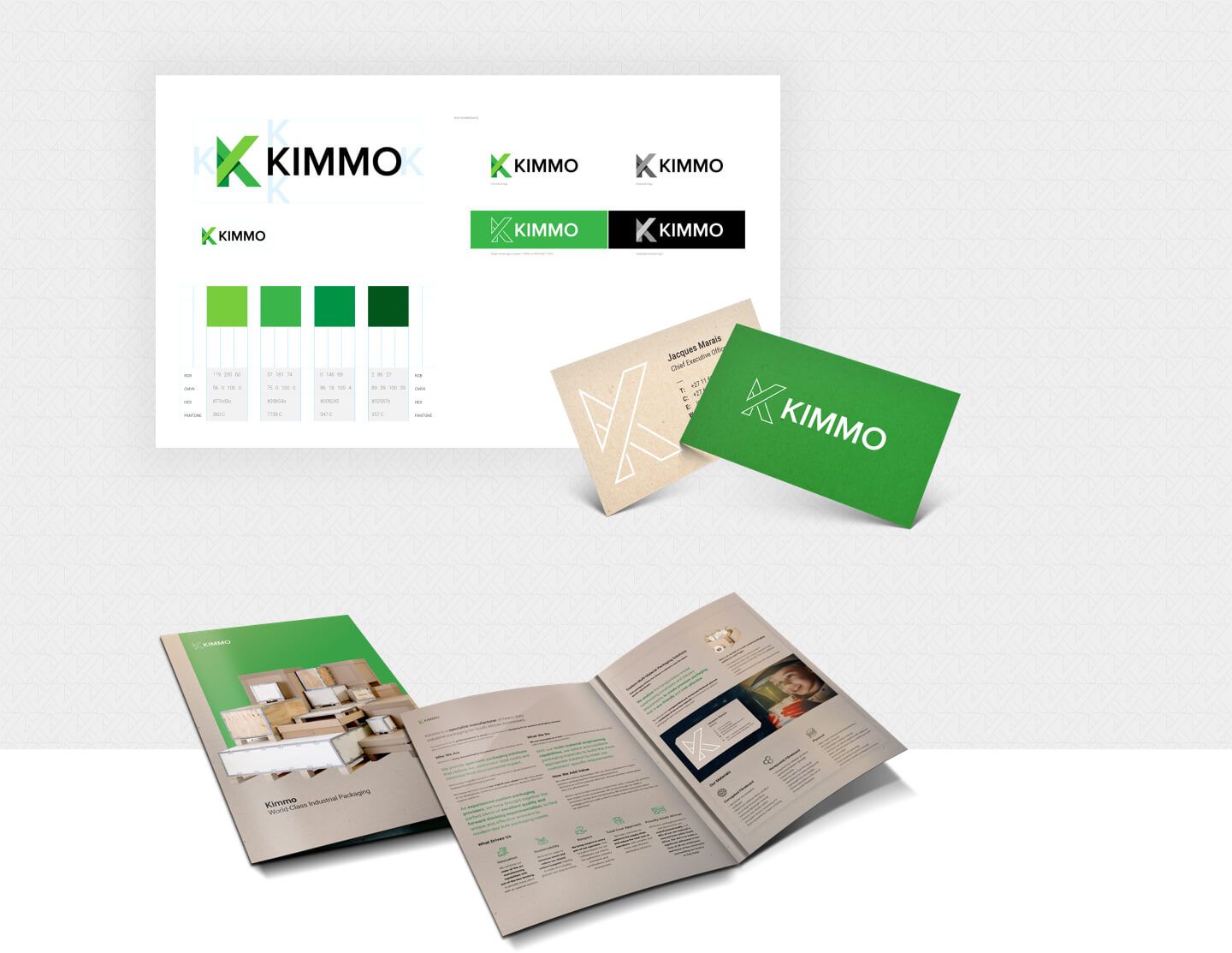
Kimmo Brand Development,
Website Design and Development
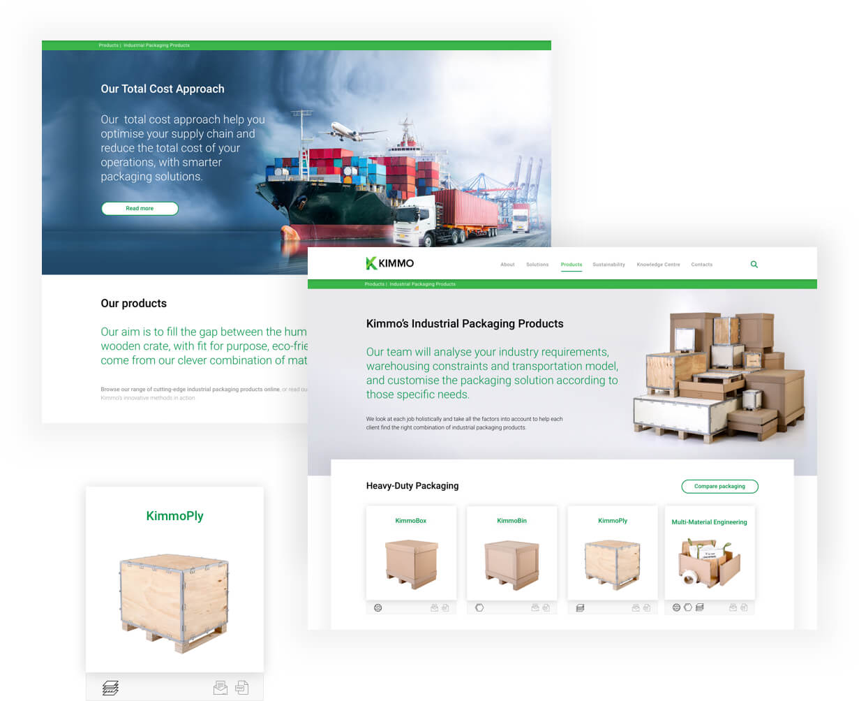
Kimmo is a specialist manufacturer of heavy-duty industrial packaging for South African businesses with a reputation as packaging pioneers, thanks to their innovative and green approach.
Re-branding and identity roll-out
Kimmo’s extended product line added exciting new materials to their flagship range of honeycomb fiberboard packaging solutions. The old Kimmo logo was created with a prominent honeycomb shape which is too product-specific and limits the Kimmo brand to a honeycomb packaging solution.
We were approached to create a new identity that would build upon the established brand and update it to align with the future plans and expansion of the company.
The new logo plays on the idea of foldable and stackable elements, much like the packaging solutions available to clients. The bold ‘K’ is also easily identifiable and allows for product and shipment branding that stands out and easily reduces to a one/two color option depending on material and shipment specs. It also communicates clearly on all digital applications and social media.
The primary color palette was expanded to include more variations of green and the new secondary color palette enhances the overall brand impact.
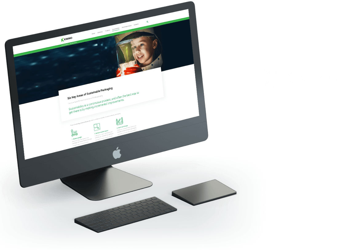
Website design and development
The challenge on this website was to portray the brand philosophy (innovative, green, sustainable, creative, caring, and trustworthy) in a convincing and balanced environment as well as communicating the extended product line-up in a user-friendly and easy to navigate site.
The technology utilized is a combination of PHP 7, JSON, and Bootstrap 4.
Utilizing JSON allowed for quick inclusion of related products and accessories on various pages, and made it possible to easily update information in a single location for a flat site that does not use any database storage.
Website: Admissions Africa
Website: iZinga Assist
Let's talk
We would love to hear what’s on your mind


