Admissions Africa Branding
Admissions Africa
- Design
Admissions Africa is a mission-led business bridging the admissions gap between candidates from Africa and prestigious international business schools.
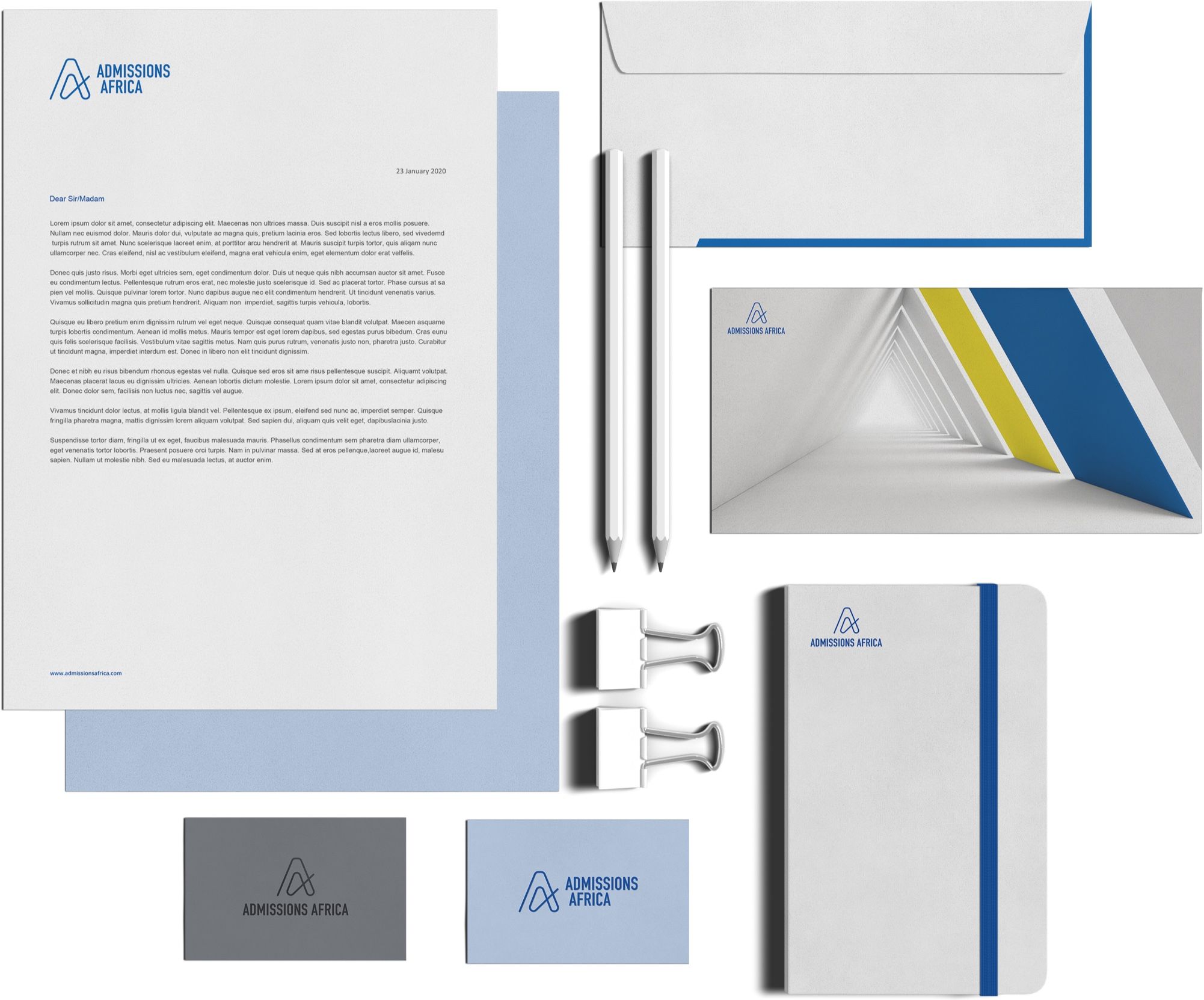
Branding and identity roll-out
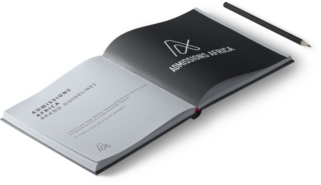
Admissions Africa approached us to create a brand that would function in the elite business school space while still feeling approachable to applicants. We approached the logo with a clear focus on the collaborative aspect of the business that brings together admissions consultants, tutors, business schools, students with a variety of backgrounds and ages, and business school candidates in different stages of their applications.
The strong visual impact of the double 'A' and the interplay with the two letters is intended to represent the two parties - candidates and business schools - working closely together.
As the two parties continue on their path together, the goal of Admissions Africa is for their journey to end positively, indicated by the concluding upward line that lends an upward momentum to the overall logo, creating the feeling of "taking off".
The logo has been created with a sense of movement and flow in mind to demonstrate the dynamic nature of the partnerships. The hope and intention are for all partnerships between applicants and business schools to conclude positively.
There is a good balance between the flowing momentum in the icon and the strong, clean typography. The end result is a very simple but strong, sophisticated logo that is easily identifiable and can be scaled down easily for digital applications without losing any identifiability.
Website: Access Africa Direct
Website: Kimmo
Let's talk
We would love to hear what’s on your mind


